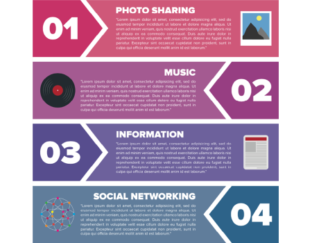
Help subscribers find stories without scrolling
When you have a longer email newsletter, add a table of contents to help subscribers see all of the stories available without having to scroll.

Here’s how, according to Kim Flaherty, et al., authors of Marketing Email and Newsletter Design:
- Add a table of contents when you have 5 or more pieces in a newsletter that covers more than 2 printed pages.
- Place the table of contents so that it’s visible, along with some content, on the first screen.
- Consider mobile readers. How does your table of contents look on the small screen? Don’t make readers zoom to read.
- Include brief headlines. That’s full headlines, not just Case study.
- Avoid redundancy. Don’t include a blurb if it just repeats the headline.
How can you reach nonreaders with email?
Just 24% of email recipients fully read email newsletters on mobile devices. The rest skim — or just glance at — their messages.
 So how do you get the word out to flippers and skimmers via email headlines, decks and other display copy?
Find out at Think Inside the Inbox — our email-writing workshop that begins on Oct. 17.
You’ll learn how to get the word out to email recipients with our simple test, boost readership by choosing the right template for your email newsletter, and avoid getting your headline cut off on mobile email apps.
Plus: Find out how to write links that boost your click-through rate on mobile, where email recipients click on 40% fewer links.
Save up to $100 with our group discounts.
