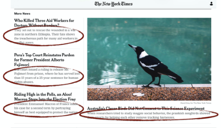
How to craft the summary blurb under the headline
Decks — those one-sentence summaries under the headline — do the heavy lifting on webpages.

Indeed, according to The Poynter Institute’s Eyetrack III study of reader behavior:
- 95% of webpage visitors read all or part of the deck. That’s huge when compared with any other element on the page.
- Visitors spend five to 10 seconds, on average, looking at the deck.That seems like a flash, but it’s actually a substantial investment in a scanner’s time.
- Decks “may be the only thing many readers view,” Eyetrack III researchers say.
If you want visitors to pay attention to your point, the researchers say, put it in the deck. Yet too many corporate communicators drop this power tool of communication.

Why decks?
No doubt about it: Decks are power tools of communication. Decks are important because they:
- Orient visitors at a glance, letting them know whether they’ve arrived at the right place.
- Offer a second layer of detail to scanners who don’t read word-by-word.
- Take a load off (and words out of) the headline.
(Still not sure what the deck is? The deck for this piece is “How to craft the summary blurb under the headline.”)
How to write a deck
To write an effective one-sentence summary under your headline:
- Explain your message in one sentence. Make it a full sentence.
- Telegraph a single point. Choose a secondary angle deck to go with news headlines, a summary deck to go with feature and benefits headlines.
- Tell, don’t tease. Don’t try to trick visitors into reading the page. Instead, summarize the page so well that visitors can get the gist of the story without reading the text.
- Don’t repeat yourself. This is San Francisco real estate. Make each word do new work. (Besides, repeating words in the head and deck may be a clue that you’re saying the same thing twice. Force yourself to revise repetitious layers of information.)
- Keep it short. Aim for 14 words or fewer. People read decks because they’re short and easy to scan. If your deck becomes a paragraph, it will lose its power to attract.
Don’t drop the deck.
This second layer of headline is essential to communicate to today’s audience of flippers and skimmers.
So don’t drop the deck — from webpages, news releases, blog posts and other pieces. Why skip the most important element of your piece?
How can you increase reading on smartphones?
It’s 48% harder to understand information on a smartphone than on a laptop. So how do you make your writing style easy to understand — even on the small screen?
 Learn how to write readable web pages that don't overwhelm mobile readers at Reach Readers Online — our web-writing workshop starting on Oct. 23.
You’ll learn proven-in-the-lab best practices for increasing web page usability up to 124% … how to pass a simple test for writing paragraphs visitors can read on mobile … and how to avoid making visitors “visibly angry” at verbose sites that waste their time.
Save upto $100 with our group discounts.
